
An Exhibition by Andy Rubio
9.16.2022 -10.7.2022

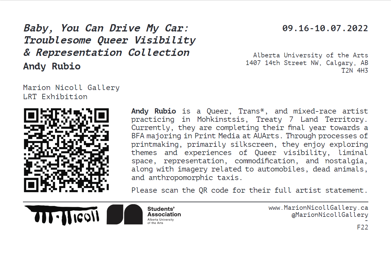
01 - Artist Bio
Andy Rubio is a Queer, Trans*, and mixed-race artist practicing in Mohkinstsis, Treaty 7 Land Territory. Currently, they are completing their final year towards a BFA majoring in Print Media at AuArts. Through processes of printmaking, primarily silkscreen, they enjoy exploring themes and experiences of Queer visibility, liminal space, representation, commodification, and nostalgia, along with imagery related to automobiles, dead animals, and anthropomorphic taxis.


Throughout the process and the work conducted over the course of last year, I have been thinking primarily about the concepts of visibility, concealment, and disguise through the lens of queer experience merged with classic taxi visual elements. These concepts are the intersection between the two, so to say, like a traffic intersection. Additionally, thought has been imbued about the ideas of commitment, return, revisiting, repetition, and uniformity.
Investigating how queer experience can be represented through taxi imagery and character towards the forming of a visual language, in which I fumble to learn where I sit on logistics of representing myself, I have created this character as the mending between my chosen concepts and visuals. An anthropomorphised Checker Cab taxi, dawning big cherry lips and blue eyes, is an extension of myself similar to Ebecho Muslimova’s character Fatebe, they are not just a character drawn in repetition – and possibly obsession – but also a persona. An extension and characterisation of experiences pertaining to my queer-being in a cishet world. As well, they are a representation of the tensions both shared and personal in the terms of being visible or of having visibility: the empowerment and danger, the responsibility and commodification. Big red lips and blue eye shadow link - for me - to the world of drag performance and child-like play. My interest to merge and repeat my concepts and visuals stems from a motivation to practice commitment and repetition in my artistic practice. An attempt, too, in the intentional creation of a body of work.
As a queer and trans individual, not to mention also being racialized, visibility is fickle. It can be empowering: getting to see others I can relate to and to be seen by others that can relate to me, positive recognition. It can be educational: my body, presentation and being as a teaching tool to those curious and naively ignorant. On the opposition, it can also be dangerous: more recognition begets more harmful targeting. It can be reductive: ensued commodification and co-opting, labour with a quarter of the pay. For taxis, visibility is crucial: to be recognizable as a certain service, to be summoned and approached. Though who drives the taxi also holds power in deciding who is worthy of accessibility, in other words, power to perpetuate the relations of oppression. Overall, I have been meditating on the questions: What does it mean to “be visible”? Who are we visible to? How is visibility validated (by the masses or our individual selves)? How we are represented and how that representation is configured through narrative is crucial to reception. How do I want to represent myself and through what narrative? Because I am making art that is calling attention to Trans visibility, I believe it is important to analyze how I am navigating the representations I am creating. I’m responsible for the representations of my experiences – they affect how I understand and view myself. In my work, I want to acknowledge where I’ve met struggle while also being cognizant of how I form meaning about myself, to give myself a positive feedback loop of reflecting and making through adding humor and playfulness. Visibility is a matter of representation. Representation is an interaction between viewer and viewee.
My chosen audience, who my works are speaking to and who it’s meant to be legible by, is my queer and trans* peers through a visual language compiled of reference to historical ephemera in queer and kink communities. In Queer bar scenes of 1960’s North America through to the 80’s, covert means of communication provided an avenue for safe communication and executing relations. In present day, the struggle with visibility and representation continues to dance between high recognition and high risk. Risk such as the commodification of individual identity for the benefit of an institution. My works reflect on the visibility of Queer experiences by imprinting elements of a personal visual identity – an anthropomorphized taxi character – onto ephemera selected from these Queer histories. These objects now linger in a digital age as nostalgic conventions offering experiences of mimetic engagement and potential return; covert forms of communication are always prevalent in times of particular restriction and oppression. For now, they are practices appropriated – used without the full knowledge of context – or practices well researched but primarily unrequited and novel. As artist-rendered commercial objects, influenced by Andy Warhol and Hal Fischer, they subvert the interaction of commodification and rather than calling for monetary exchange, they activate human connection in places where it is censored. To make visible in positive affirmation the subjects they embody.
Queer & Trans* bodies are taxis into the future, the avantgarde, force for change, ushers. A culmination of past histories connected through identity, not by blood or biological lineages. Yet also remain as entrance ways to the future, we inform what comes next – especially in terms of fashion and how it’s thought about – but it also seems as if we have become from the future, something beyond us that we don’t quite touch visually or physically, but we stem from and reference to. Both part of an endless evolution towards and a reflection of something not yet seen.

02 - Artist Statement


Queer Anon Love Inc. Matchbooks
Feb. 2022 Silkscreen print on Maidstone, digital print on Epson Glossy, domestic objects Varied edition of 50 matchbooks each 1.5”x2”, each digital print 8”x11.5”
Queer Anon Love Inc. Matchbooks present viewers with an opportunity for contact and starting new connections. Participants are welcome to share a name, phone number, and a social media tag. Matchbooks were used as covert means of sharing phone numbers, and businesses would produce and keep on the counter their own custom matches that could be grabbed, shared, and used. The matches then became not only a dissemination of advertisement for a business, but also dissemination of personal connections and highlight locations for Queer communities.
Queer Anon Love Inc. Hankies
Mar. 2022
Silkscreen discharge and pigment print on dyed cotton, digital print on Epson Glossy, repurposed worn jeans 20 hankies in 10 colours each 19”x19”, each digital print 8”x11.5”
Queer Anon Love Inc. Hankies present viewers with an opportunity for choice. Choice to play with a role, power over presenting how the individual wants to be presented to others. Rolling off the historical and present practice of flagging, as it has appeared in Queer communities as the usage of a “Hanky Code” for expressing desired sexual or dynamic activities inviting a potential partner with compatible desires. Using an array of colours as specific markers towards activities the wearer is interested in, the hanky is worn in the left or right pocket to signify the desired role within that activity. Left as the dominant role and right as the submissive.


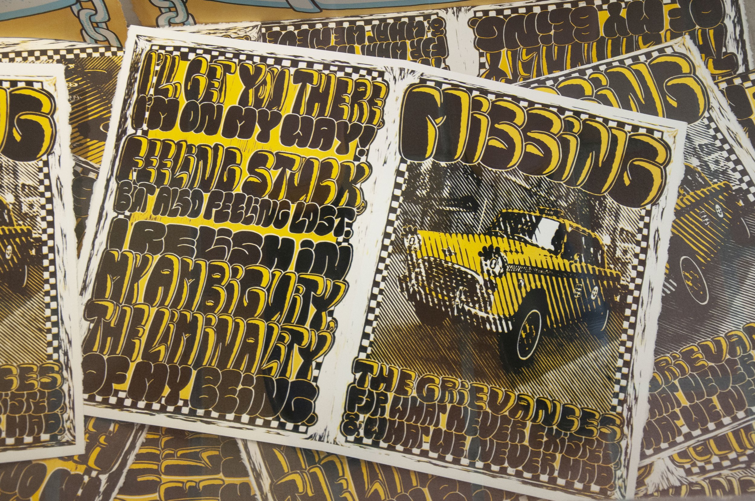
Neither Here Nor There… But Also Here And There
and Missing Grievances Sunday Paper
Mar. 2022
Silkscreen on Maidstone, linocut relief colour reduction on Maidstone, digital reproduction on Epson Enhanced Matte
Each print 15”x22”
In order: edition of 20, edition of 10, edition of 4
Neither Here Nor There… But Also Here And There and Missing Grievances Sunday Paper touch on something not quite tangible, the words at the tips of our tongues to talk on the experiences that we can’t quite define, but manage to still live. This work digs deeper into taxis and queerness as liminal space. Delight in confusion and ambiguity. A box that reaches back into both concealing and exposing the contents within, promising what may be inside.

Neither Here Nor There… But Also Here And There and Missing Grievances Sunday Paper Mar. 2022 Silkscreen on Maidstone, linocut relief colour reduction on Maidstone, digital reproduction on Epson Enhanced Matte Each print 15”x22” In order: edition of 20, edition of 10, edition of 4
Neither Here Nor There… But Also Here And There and Missing Grievances Sunday Paper Mar. 2022 Silkscreen on Maidstone, linocut relief colour reduction on Maidstone, digital reproduction on Epson Enhanced Matte Each print 15”x22” In order: edition of 20, edition of 10, edition of 4

Hey! Hey!
Dec. 2021
Acrylic silkscreen on Stonehenge paper
29”x22”
Edition of 5
Hey! Hey!, began focusing on these questions: How are we visible to ourselves? How Are we disguised from ourselves? In the form of a short visual narrative, reminiscent of the familiar children’s book Are you my Mother by P.D. Eastman. This also explored printing on black paper.
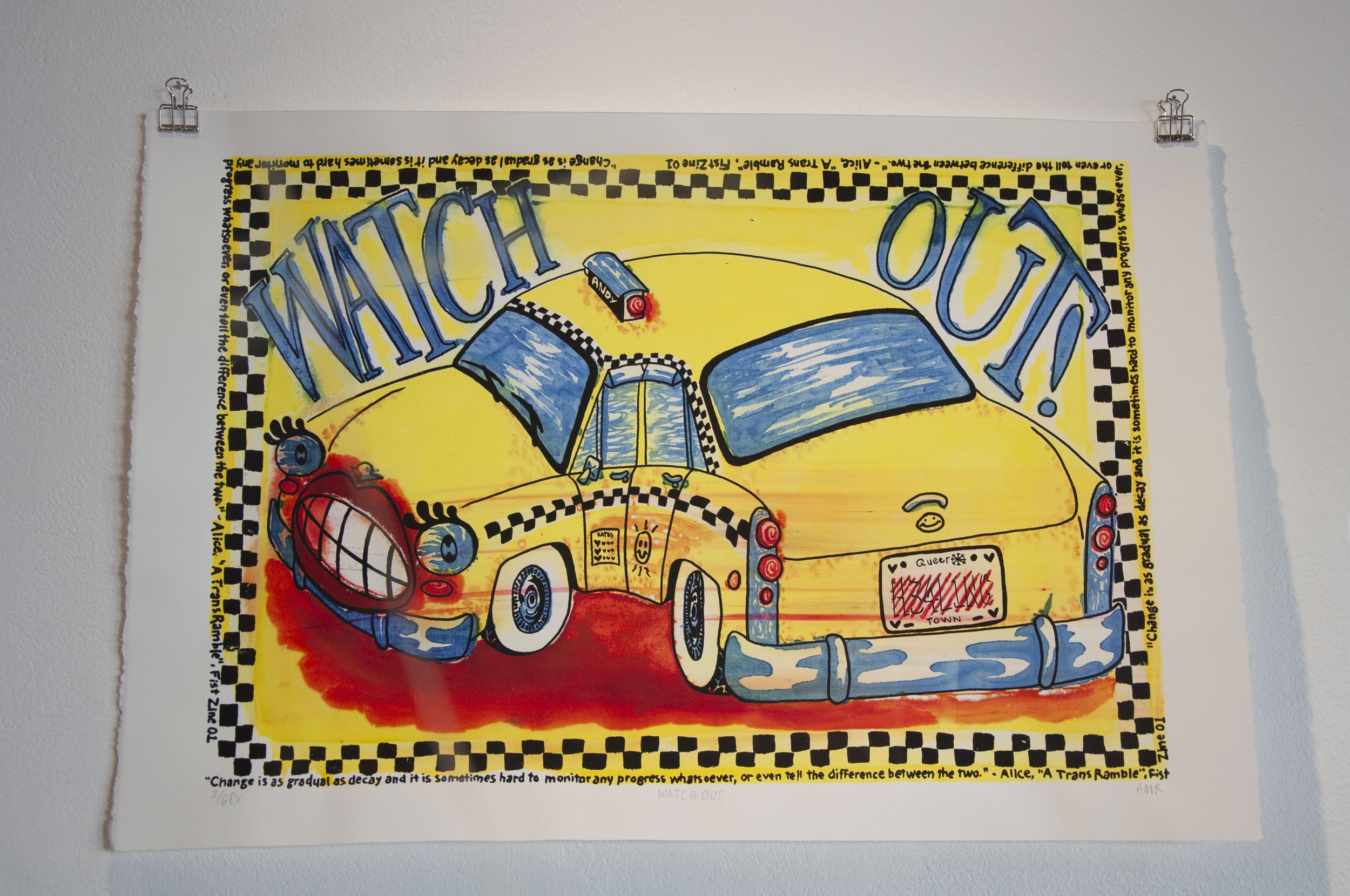
Watch Out!
Nov. 2021
Polychromatic silkscreen (Procion MX dyes) on Maidstone paper
13”x19”
Varied edition of 6
Watch Out! begins a lead into focusing on the relationship to self and healing. In process, it was a study in learning polychromatic screenprinting.

Can I Help You?
Dec. 2021
Stone lithography and acrylic silkscreen on Arches paper
22”x29”
Edition of 4
Can I Help You?, focuses on my responsibility being visibly queer as education tool. That includes to myself, to queer kin, and to others that just don’t know. My body has and is an educational tool in its scars, my presentation, and lived experience. Additional to lithography, this print involves silkscreen printing.
Beep Beep Bitch
Oct. 2021
Acrylic silkscreen on various sheet materials
(Maidstone, checker/white/silver tissue papers, holographic plastic wrap)
19”x13”
Varied edition of 10
Beep Beep Bitch was my introductory print into this body of work, capturing a general sense of my ideas. As well, an exploration into materials printed upon.

Beep Beep Bitch Oct. 2021 Acrylic silkscreen on various sheet materials (Maidstone, checker/white/silver tissue papers, holographic plastic wrap) 19”x13”Varied edition of 10